Multi sensor time series access
Multi-sensor time series analysis is a key research area that we support with PROBA-V MEP. Using our data client library, you can now access PROBA-V, Copernicus Global Land, and Sentinel-2 data products.
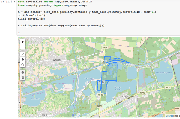
In the next examples, we’ll use a nature reserve in Belgium as a test area. When we visualize this in our notebook, it looks like this:
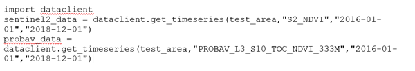
Now we want to retrieve a time series for our area of interest, referenced in the code as ‘test_area’. Using the Python ‘dataclient’ library, this is rather straightforward:
This library returns the average value for all pixels inside a test area as a series object from the widely used Pandas library, which will be familiar to a lot of data scientists. You can use this for further analysis, or simply plot a graph to analyse the seasonal vegetation cycle:
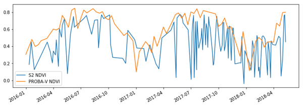
When computing these averages, we fully take into account missing values provided by the Sentinel and PROBA-V cloud (shadow) masks. Especially for Sentinel-2, these masks are not always perfect due to undetected clouds or shadow, which results in a lot of remaining noise in the output. Removing this noise by applying pre- or postprocessing is a hot topic in remote sensing research.
Histogram access
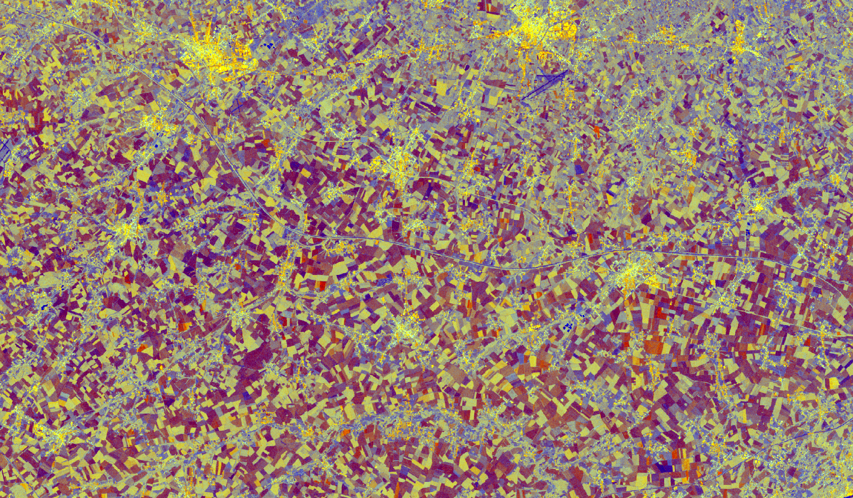
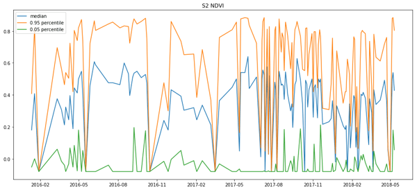
Only retrieving the average time series may constrain you too much in your exploration options, so we also provide the option to retrieve pixel counts for each unique value in the input image (or histograms), which works especially well for data products that are natively represented by a limited range.
The figure belows shows some statistics that can be derived from the histogram data returned by the data client. The notebook linked at the bottom of this blog post contains the full code to create this figure.
Time lapses
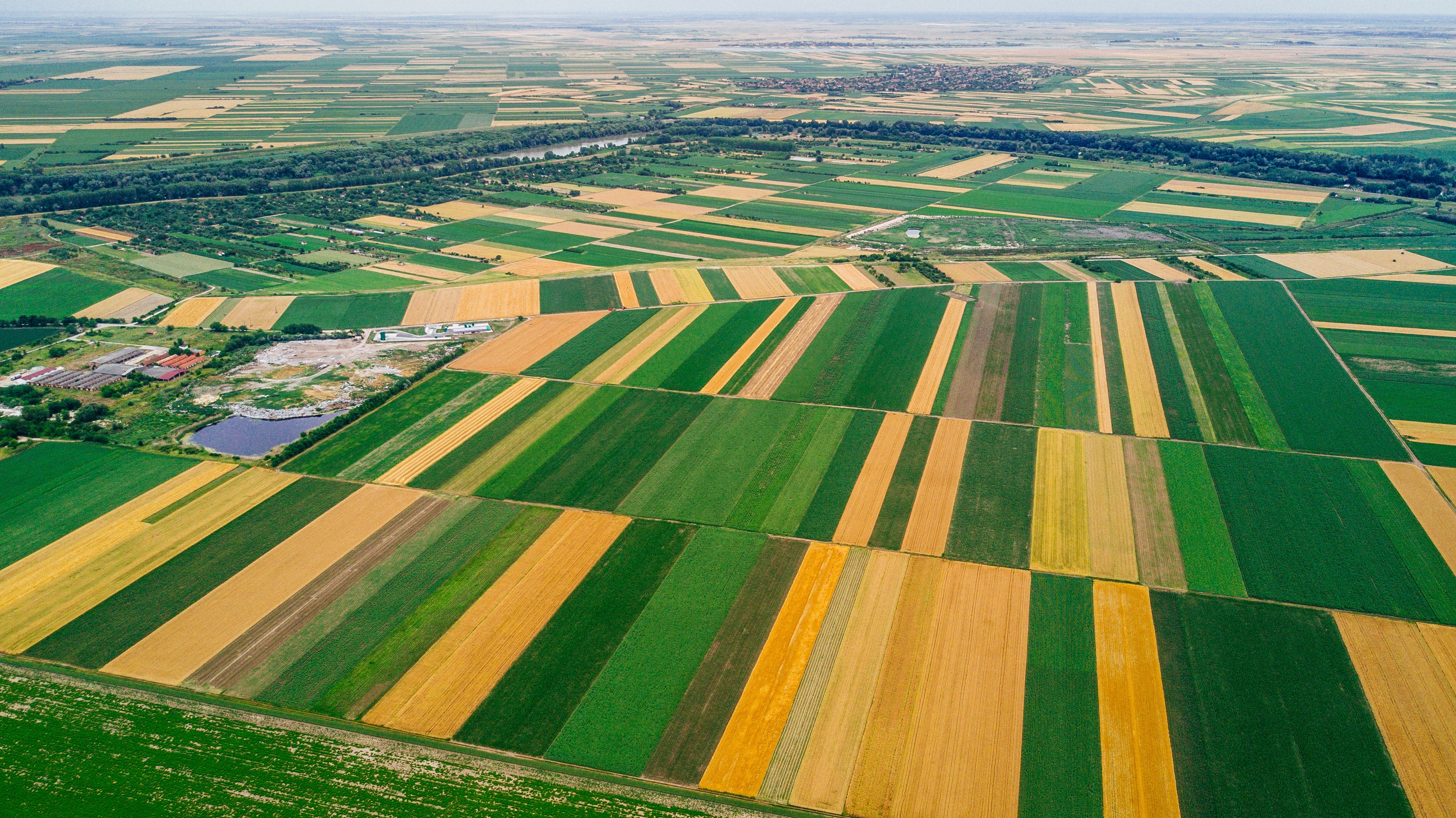
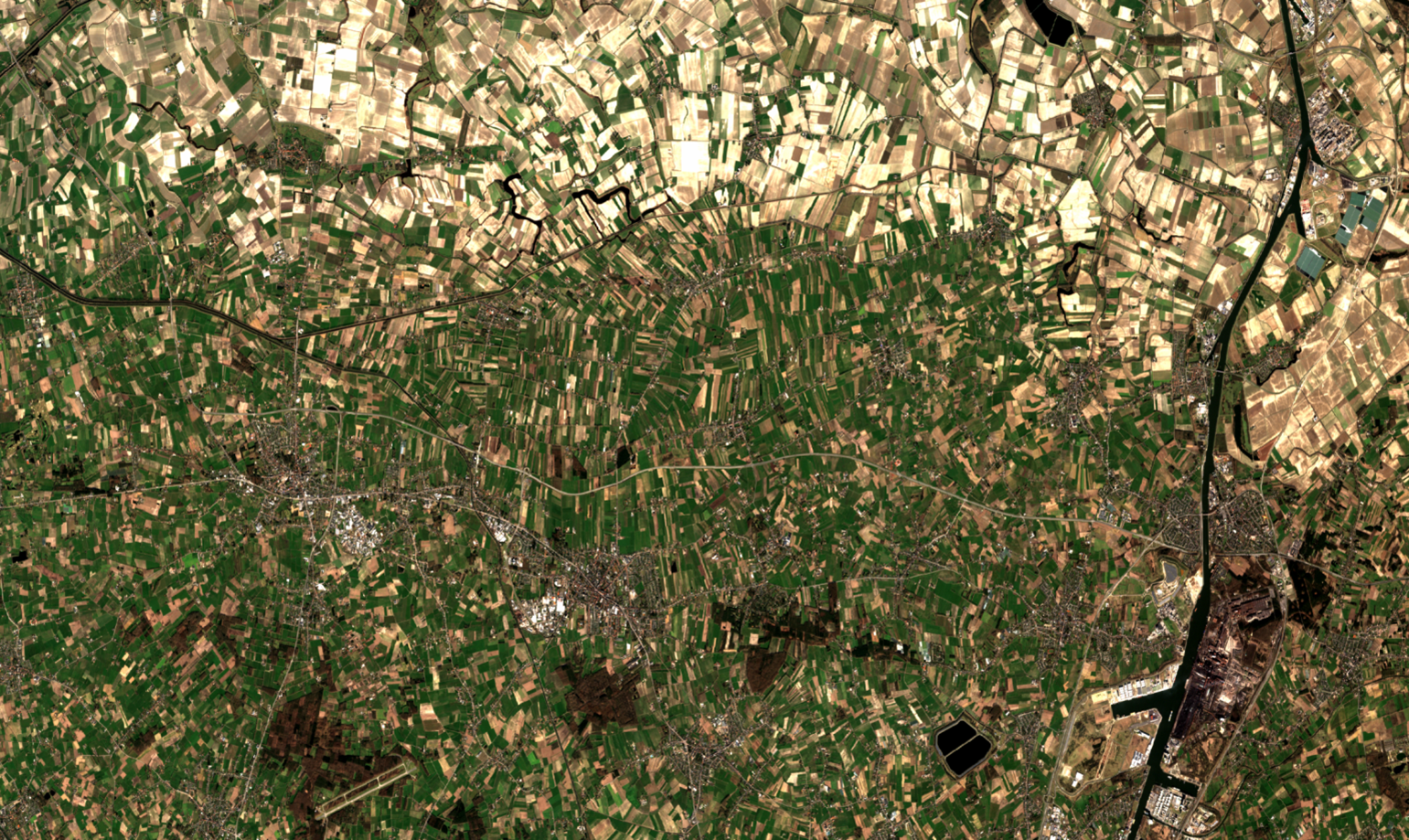
When you still can’t find a suitable explanation for how your plot looks, you may need to dive into the actual imagery. Off course you can use your PROBA-V MEP virtual machine to fire up QGis and open a bunch of Geotiffs, but you can try using our data client library to just download the images for your area of interest:
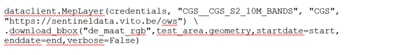
This call will download all the images corresponding to the bounding box of your area of interest into a directory, as geotiffs. In this case, the geotiff will contain the 4 Sentinel 2 bands that have 10m resolution, for every observation of the area of interest.
Now that all images are available as geotiffs, we can use the matplotlib library to create a time lapse animation, which can be shown directly in the notebook, or exported. The end result looks like this:
This time lapse shows how Sentinel-2 images on the MEP are quite well-aligned geometrically. We achieve this by doing our own geometric correction. This is a prerequisite to make our Sentinel-2 products suitable for time series analysis.
And there’s more …
These examples do not yet cover the full possibilities of the data client. For instance, we also have some dedicated calls to retrieve a large number of time series as fast and efficiently as possible.
Click here to view the full Python notebook , or try it yourself in the PROBA-V MEP notebook environment.
Give it a try, and if you have questions on the usage of our library, or suggestions for additions, contact us!