The importance of spatial models in large field experiments
If you are working with agricultural field trials, you are very much aware of the variability of plant characteristics within such fields. While you hope to estimate accurately the effect of the product you applied or seed variety you planted, you are often confronted by the variability between individual plants and the within environmental conditions (soil, water availability, pathogens, ...) Whereas differences between individual plants are levelled out by averaging large amount of plants within a plot, the environmental influence is the main challenge for making accurate evaluations in field trials.
Currently there are statistical models available that incorporate a spatial component to adjust for the environmental heterogeneity and to obtain less biased estimates. The introduction of such models in the trial strategy has led to:
- reduced need for replication
- minimize costly seed production of early testing
- optimize the use of testing material by using the same amount of seed or product over multiple locations
In recent years, the p-rep design became popular for early generation field trials because of this reason. In a p-rep design, only a part (p) of the entries is replicated (rep), whereas the rest is grown in only one plot. The replicated entries are used to find out what the environmental variability is in the field and the estimates for the not replicated plots are adjusted with that same model. This all succeeds on condition that the spatial heterogeneity and its impact on the experimental entries can be properly modelled.
From single data points towards continues surface measurements
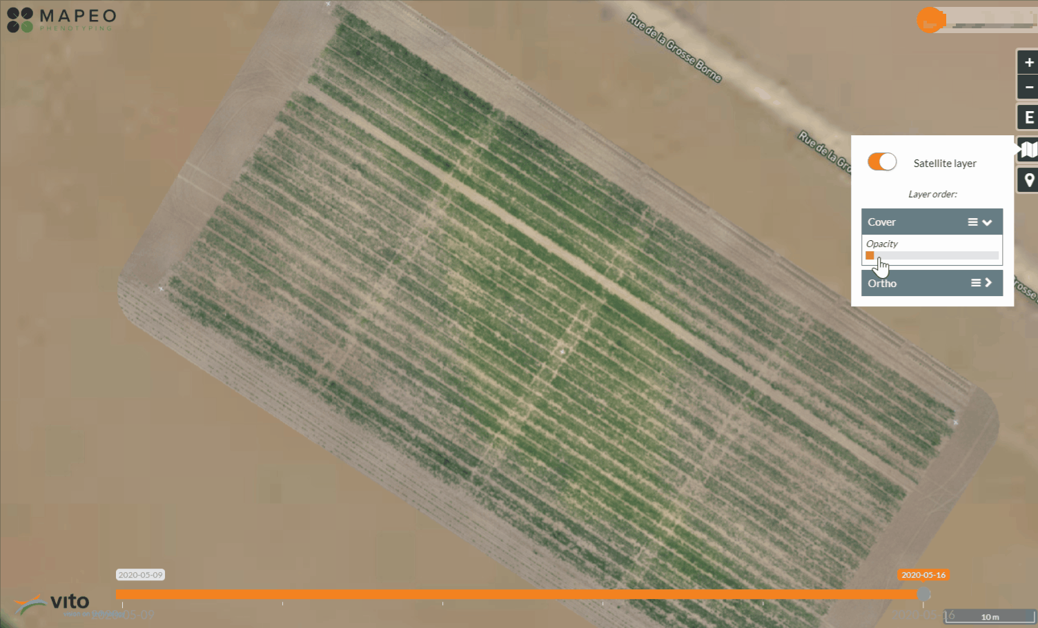
Classic ground observations, like yield, vigor or pathogen scoring data, assess an entire plot by a single data point because of labour intensive data capturing methods. This is different for data coming from drone imagery which inherently cover the complete field with literally millions of pixel values. Within one overview the inter and intra-plot variability caused by environmental gradients become suddenly visible. The question is, what do we do with this wealth of information? Do we reduce it to a single plot statistic so that they can be integrated into existing data pipelines? The answer in many cases will most probably be 'yes', but let us take it one step further. We can use the fine grid data present in these image products to assist our spatial models in separating the entry related data from environmental noise. Let’s see how!
A drone based view on spatial variability
An example with simulated data
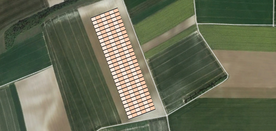
We have seen numerous cases in the past which visually shows fine environmental gradients in our drone data but it’s difficult to prove how it influences our decisions. We therefore demonstrate our approach on simulated data so we can define exactly the complex mixture of entry effects and environmental gradients. Models that best retrieve the entry effects, we can trust. In the example below a typical experimental wheat field layout is shown with a p-rep design of 100 entries with 2 replicates and 100 entries that are not replicated. As can often be seen in aerial images, the heterogeneity has a mixture of strong and weaker spatial gradients.
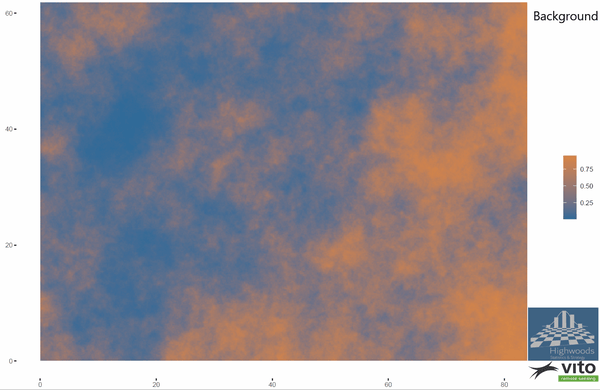
Simulated background fertility and p-rep experimental design
On this field, entries are assigned to plots and the entry effects are superimposed. The result is shown below along with the average value per plot. The finer information gets lost, yet there are some general trends of the original field still visible. Obviously, the effects of differences in background fertility are easier to distinguish from the entry effects when you can use grid data instead of single point plot data.
Example of the background +entry effect: grid versus plot values
The goal of our analysis is to predict the entry effects using either the plot data and/or the finer grid data. For the first dataset we’ll be using the well-known spline-based SpATS model (Wageningen University), for the finer grid data we applied our adapted model that is based on Bayesian spatial models capable of handling these high amounts of dense data and fitting far more flexible gradient surfaces without overfitting them (and hence losing the entry effects).
results show 15% improvement in correct entry selection
Both models return a surface representing the background fertility and predictions of the entry effects. The later are shown below for both models. The predicted entry effects follow in general the effect sizes that have been used in the simulation. In a perfect world all dots would be on the diagonal line. Yet for the plot-based model, large deviations can be spotted, particularly in the nonreplicated entries (the red dots in the graph). Some are more than 15% overestimated, which is the price that needs to be paid for the low replication. Compare the graph with the one obtained with the finder grid model. The predictions follow now much closer the real effects. The distinction between replicated and not replicated entries is also far less.
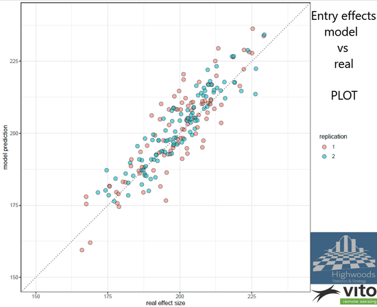
Simulated versus predicted entry values: grid versus plot-based models
But how much better are we when using the grid-based approach vs plot-based? Well, if we would select the 30% best of our entries for further development, the plot based approach would select 20 out of the 30 most performing entries while the grid-based approach selects 25 of the top performing entries, which in this case is a large improvement.
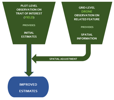
Improving yield predictions
Despites the many interesting traits assessed via drone images, most breeders are still primarily interested in yield. Yield is still difficult to predict remotely and anyhow harvesters will tell you exactly how much a plot produced. So, have drones nothing to offer for yield?
Quite the contrary! By using the previous described methodology you can also improve the assessment of the yield potential of an entry by incorporating drone data. The trick is to adjust the initial predictions for the plot entries made by ground observations (e.g. yield) with the higher spatial resolution observations made by a drone. The approach works best on trials with low or no replication, as expected. The improvement is a very valuable add-on on the other trait information drones can provide.
Do you want more information about our simulated data or try the methodology to one of your fields, don't hesitate to contact us. We're ready to assist you in getting more out of your drone data.

/Blog%20Post%20Strip%20Cropping%20-%20Featured%20Image%201200x650%20150%20ppi.png)
/Blog_WorldCereal_1200x650.png)
/lewis-latham-0huRqQjz81A-unsplash.jpg)